
We’ve only dipped a toe into 2025 and already we are seeing a new color trend emerge from the shadows—pastel, baby, or light pink. This is just the newest installment of the pink revival that we’ve been seeing since the mid 2010’s—a pink renaissance, if you will. Everyone who knows anything about fashion is predicting it will stick around the whole year and isn’t just a fleeting fancy so it’s worth discussing and if I need to write more on it as the year progresses, I will! You’ve probably already seen it walking red carpets and catwalks if you’ve been paying attention! Typically pastels don’t pop out of the ground until spring but this year, it looks like they’re blooming early!
If you remember a few years ago—around 2019 or 2020, I think—ballet pink had it’s run as one of the most popular colors especially in designer fall/winter collections. It was absolutely everywhere! I remember this trend because I indulged and purchased a ballet pink sweater for my mother that Christmas. It was recent enough that I think it’ still matters ‘s still relevant to the current resurgence of the color that we’re seeing now however there is a big difference between ballet pink and pastel pink. Ballet pink is a warm shade closer to orange and true pastel pink is a cooler shade closer to purple. You may fact check me with a color wheel. If you still don’t understand, I can’t help you but I’ll keep you in my thoughts and prayers—it’s like calling a shirt blue instead of cerulean or purple instead of lilac. We don’t do that here.
Millennial pink—also called rose quartz pink—features light pink with twist of added salmon and gray and has continued a long run since the 2010’s and was named Pantone’s color of the year in 2016. You’ve seen her pop up every now and then—she never really goes away, just waits. Her metallic shade, rose gold, has also been on the rise since it first became popular during the Victorian era in fine jewelry and later saw a revival as an accent metal during the Art Deco and Retro periods. For anyone wondering, it is the addition of copper that gives rose gold it’s “rose” color. Most recently it was made into a popular Iphone option and has continued with a similar, yet slightly slower trajectory as Millennial pink. Not that I’m tracking it or anything.
So, I suppose we’ll keep seeing pink across runways and collections on mass—in it’s many different forms—and I’m not pressed about it! After the huge madness of hot pink, specifically, during the Barbiecore revival, it is refreshing to see a different shade of a hue that I love so well and one that’s arguably more compatible with everyone’s coloring. We might as well talk about sister pink and how to style her because she’s won’t be leaving us alone anytime soon!
Pretty pinks
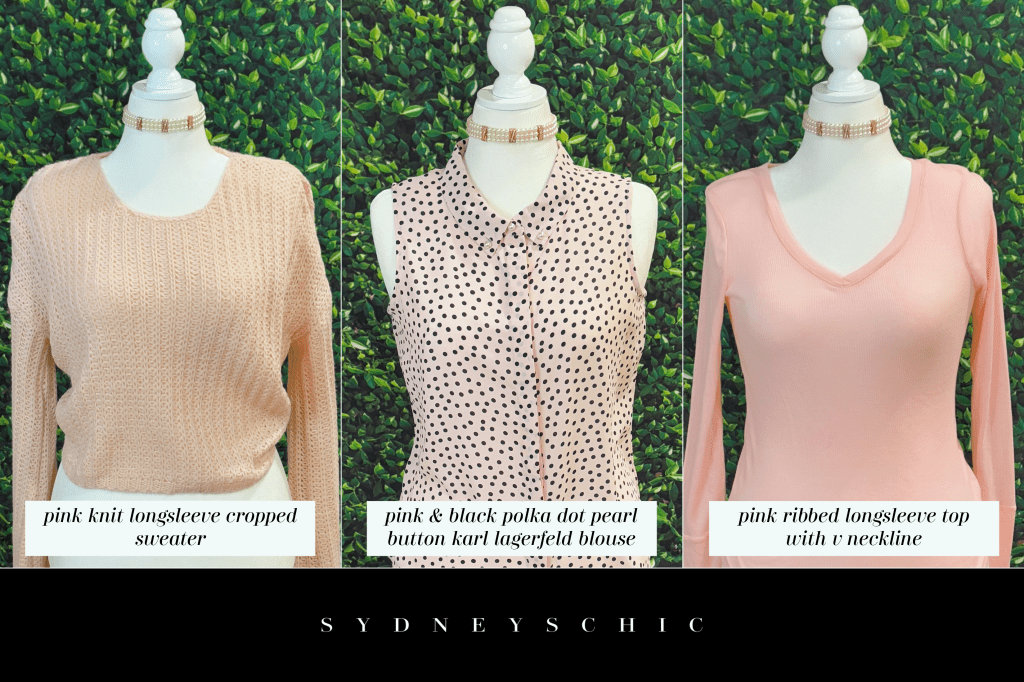
Pictured above are three blouses from my closet in the pastel pink family. While they’re all similar in color, they are not the same and there’s subtle variations in hue if you look closely enough. Since we are still in winter where I am, the tops that I picked are transitional with a heavier knit sweater, simple long sleeve ribbed top, and a button up tank by Karl Lagerfeld. These can all be layered up to be worn in colder weather or layered down for convenience as we head towards spring.
In my opinion, pastel pink is one of the easiest colors to style because of it’s versatility and also the fact that it can almost pass as a neutral. I know that pastels are typically seen as spring/summer colors but I’ve always worn this shade of pink throughout winter because this particular shade is the cool side of a warm color. If it was warmer—with peach and orange—it probably wouldn’t work as well. This beautiful pearly color is one I’ve adored for a long time and I’ve never let the season stop me from wearing it regardless of the weather.
One of the added perks to wearing a pastel like this is that you can really see the patterns and textures of the fabric much better than you might in other colors that were darker. For example, you can clearly see the knitting of the first sweater which only adds interest to what might ordinarily just look like another boring sweater dangling in your closet. In pastel pink, it suddenly looks elevated and much more unique—you can see the craftsmanship. Dare I say, it looks chic and elegant, not something you just fished off a rack last season even if you did! I am a highly detail oriented person which is why I love pastels in fashion so ardently.
The same concept is true for the second shirt which features black polka dots on a light pink background—something that isn’t typical for polka dots that are usually thought of as a black and white print first and foremost. Putting them on such a light pastel gives the same look as if it were a traditional black and white polka dot fabric while enhancing the dots with a subtle hint of rose that might’ve been missing on solid white. Again, in the third shirt, you can see the ribbing which adds to the depth of the top. The lightness of color also allows you to see how the shirt is made with cuffs and trim around the neck.
Baby bold
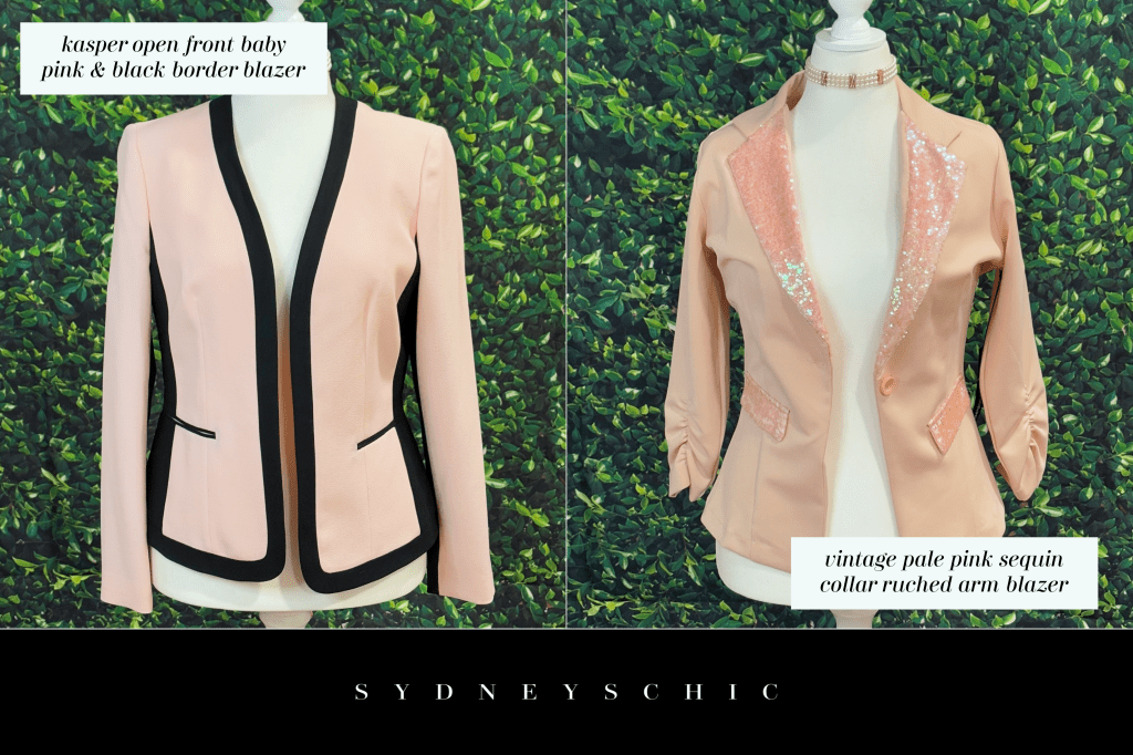
Forget subtle hints, a blazer is your go-to for a full-on color statement that instantly brightens any look no matter the occasion! Honestly, what’s better for grabbing attention and injecting energy into your style? And here’s why it’s so impactful: remember those classic, predominantly dark blazers that started out as only menswear and have slowly been adopted and transformed over time? Exactly! Seeing them reimagined in breezy, lighter tones is a total style revelation! It’s like a breath of fresh air, adding an unexpected and utterly revitalizing element to your outfit.
Blazers are a fantastic way to break up the solid color—or colors—that you’re wearing underneath. If you were wearing a black blouse and matching pair of pants, the first blazer from Kasper would work wonders in adding not only contrast, but natural division between all the seemingly seamless black. This is also important because our silhouette can become lost in too much of one color and lose definition if we aren’t careful in maintaining those natural lines, dividers, and shapes.
The same would be true if you were wearing a white shirt beneath the second vintage blazer. Even if you were wearing a classic white shirt and denim, your outfit might have it’s natural lines back but then you run the risk of it looking too boring or understated. A simple colored blazer can go a long way into turning an uninteresting, casual outfit into a well thought out and styled look. Wearing a metallic or white color under a blazer with a sequin collar also allows for extra shine and tricks of light to draw attention to the smaller details in the outfit.
The solid or sheeny white of a complimentary fabric would easily catch with the gleam of the sequins and turn drab into fab. Though she might not seem like it, this vintage piece is such a versatile blazer and could be worn in a day-to-night setting if you were in a rush and didn’t have time to stop home and change before going back out. I mean, who doesn’t love a little sparkle, am I right?
Soft touches
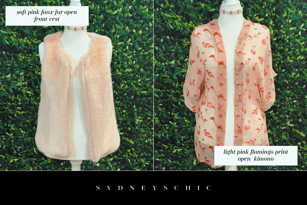
If you’re looking to introduce a touch of soft, pastel pink without committing to a full, head-to-toe look, you can easily achieve this by incorporating it as a detail. Consider opting for garments like a vest or a kimono featuring this trendy hue whether in a solid or a print. These versatile pieces can be effortlessly styled and paired with a wide array of outfits across your existing wardrobe without making you feel drowned in pink.
When a single color dominates a space or an outfit, it can feel overwhelming, almost suffocating the senses. Detail pieces—however small—act as necessary counterpoints to this possible sensory overload. They introduce flickers of variation and moments of visual rest in the vast landscape of a singular color. These subtle elements offer our eyes something different to focus on, preventing the monotonous wash of color from becoming too intense or consuming. The beauty of detail pieces lies in their ability to offer a visual break without disrupting the overall aesthetic you’re carefully crafting. They don’t necessarily clash or take attention away from your look’s focal point, but rather subtly guide the eye along and create a richer experience.
Not only would the pink vest in the first picture be a chic way to elevate a sweater, but the fur texture will add a depth to the outfit that wasn’t there before. Solids can look basic but a great way to add dimension is to throw in a print like the flamingo kimono in the second picture! Yes, it is really flamingos—I am a very lucky girl to have that iconic piece. In a monochromatic outfit, a patterned scarf or a piece of textured jewelry can introduce complexity and prevent the look from feeling flat or one-dimensional. The same is true for colorful looks! These delicate details provide nuance, allowing us to appreciate the dominant hue within a more balanced context.
Ultimately, the value of detail pieces in managing color lies in their capacity to cultivate a sense of equality. They prevent us from feeling swallowed by a single color by offering subtle disruptions and points of interest. This allows the dominant color to be appreciated without becoming oppressive. These small touches craft an understanding of visual harmony and the importance of balance in creating an intentional and stylish ensemble. They elevate your fashion choices beyond a simple application of color and bring it to life them a whole new way.
Cute coats
While light pink is often associated with sweetness and innocence, it can also be a bold and eye-catching choice that stands out against darker cold weather fashion choices. A light pink coat adds a touch of whimsy to your outfit, making your look unique in a sea of neutrals and snowy landscapes. Pair it with bold prints or contrasting colors to create a unique and unexpected fashion statement with depth. Embrace the versatility of light pink and experiment with different combinations to find your own personal style.
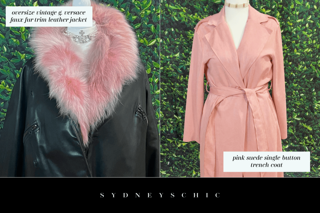
Since coats are outerwear, layering them is a breeze and you can use that layering to weave in other shades of pink or a different color entirely dependent on the vibe you’re styling for! You can use your top or sweater underneath for that added pop of color beneath a coat or jacket. For example, if I wanted to show off the color of the first sweater I pictured earlier which is a higher, rounded neck, I would pair it with a coat that had a v shaped neckline like either of the coats pictured here or at least choose one with a lower neckline than the sweater so you could still see the edges peeking out. If I wanted the pale pink color to slip just slip through, I would probably wear an open front coat or jacket so as still to draw attention to the pink.
The reverse of having your pink peek out from underneath is choosing a garment that is not pink but has it as an accent. As you can see in the first picture of my oversized vintage Gianni Versace black leather coat, it is trimmed in different shades of pastel pink and mauve faux fur. This is a nice way to wear the trend in an understated way, similarly to how we discussed vests and outfit details rather than fully wearing the color. You don’t have to drown yourself in the color and you can create contrasts by having smaller elements of it featured throughout your look as an alternative. This is also a great way for men to wear pink without “wearing pink” if you know what I mean—wear it as an accent to something more traditionally masculine like a leather coat.
I’ve said it before and I’ll keep saying it—get yourself a trench or five! Trench coats are one of the most classic additions to your wardrobe and they easily make the transition between seasons better than any other type of coat. This means that you will get more seasonal wear from a trench than you would a regular coat and if it’s too thin for the cold weather wherever you are, layer a warm knit sweater beneath. The suede pink trench coat in the second picture is one that I wear through three of the four seasons and having it in this pink adds just the eye catching color I’m looking for without sticking to a “seasonal” shade. For example, if I wear it with a crisp white turtleneck, it can be worn just stylishly in the winter as if I’m pairing it with a gold cowl neck tank in the spring. This shade of pink lends itself to many color seasons allowing for diversity in one coat.
Rose golds
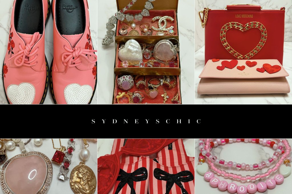
As I mentioned in an earlier post that I wrote about wearing yellow for fall/winter, jewelry is a fantastic way to pull in color for your look. With accessories, you can inject a pop of color to match your outfit or create a striking contrast that turns heads. For example, a pair of vibrant pink pearls with a black dress to create an alluring and sophisticated look. Or, complement one of our pink sweaters with a matching statement cocktail ring that extends the shade all the way down to your fingers. The possibilities are endless, allowing you to customize your outfit and express your individuality through a myriad of different jewelry pieces depending on the look you’re going for.
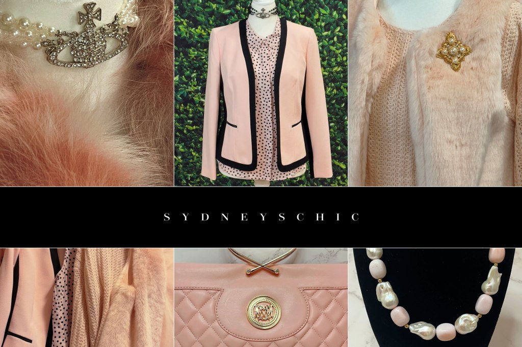
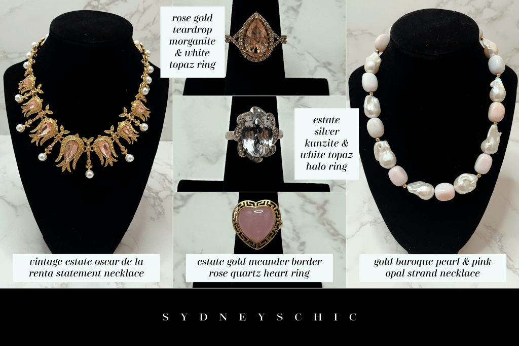
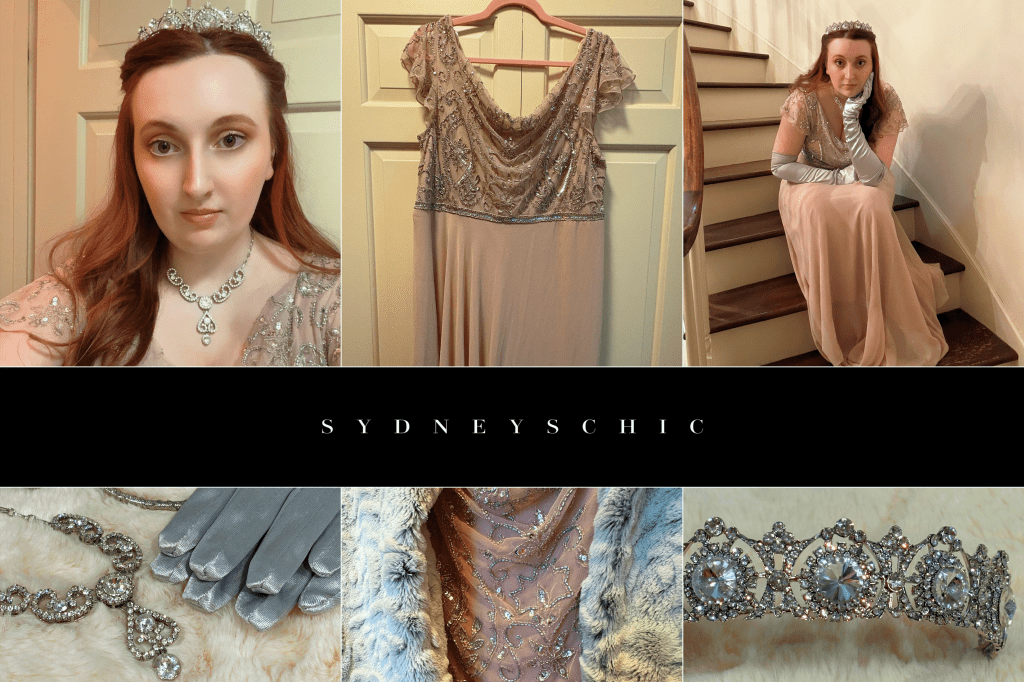
It’s fortunate for us pink fashion enthusiasts that a delightful array of gemstones in this color exist, offering endless options to perfectly complement our favorite outfits and accessories. To explain what I mean, I’ve pulled several light pink pieces from my personal jewelry collection—each a different type of mineral. This will allow me to show you firsthand the captivating variety of jewels that you can find in this beautiful hue, exploring the variety of rocks that come in this color!
If you’re not new to this blog, you’ve probably seen my vintage Oscar De La Renta faux pearl statement necklace before now in the first picture. While it’s not a natural gemstone necklace, it’s an example of how statement designer pieces can and historically have incorporated the color in couture jewelry. At the opposite end is another necklace featuring natural baroque pearls and pink opal beads with gold details from Ross Simons. This necklace has it’s pale pink beads broken up by luminescent pearls making it not only a statement piece but one of timeless elegance.
In the center, I have three rings each in the same pink color we’ve been discussing. The first is a rose gold ring featuring a teardrop cut morganite stone surrounded by white topaz. morganite is a gemstone that lends to the warmer shades of pink and is usually paired with rose gold metal. The second ring is a vintage estate silver kunzite cocktail ring with a white topaz halo. Kunzite is a pink stone though it’s cooler in nature and can appear closer to purple putting it opposite morganite on the color wheel. The bottom ring is a vintage estate gold meander border ring with a rose quartz heart at it’s center. Rose quartz has both warm and cool tones putting it in the middle as a more neutral colored pink gemstone.
Styling ideas
Now that we’ve discussed different ideas and design elements to incorporate pastel pink into your wardrobe as we transition through the seasons, I’ve quickly styled three outfits to pull together what we learned and provide you with some inspiration! I’m not going to lie, these were very fun to style and I can’t believe I haven’t worn some of these outfits already! When I do, I’ll be sure to share them so you can see how they look on a real person—no offense to my assistant, Cosmina.
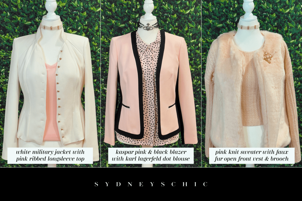
The first outfit is a vintage white military jacket from white house black market and I’ve paired it with faded glory pink long sleeve ribbed top that I got from Walmart—yes, I know. This is how good Walmart clothes can look if you know what you’re doing. It’s not where you get your clothes but how you wear your clothes. I picked this combination because the military jacket has a lot of tailoring lines and pleating in the shoulders which I thought would compliment the ribbing in the pink top—carrying through lines to create a cohesive look, if you will. It turned out really cute and I almost put a pearl brooch on for good measure but I didn’t because again, the jacket has shoulder tailoring that I didn’t want to hide. I don’t know how well you can see it but it’s worth the zoom if you must. I’d wear this look more casually with dark jeans but you could always dress it up!
The second outfit was purely an experimentation in pattern mixing between a pink and black Kaspar blazer and a pink and black polka dot Karl Lagerfeld Paris button up blouse. I thought that the colors were a close match and they turned out to be nearby identical so I thought I’d style them together for an especially chic Parisian look. The Lagerfeld blouse has pearl buttons near the neck and I could’ve gotten away with a choker or strand but I wanted something to mimic the black polka dots in the top so I went with a black beaded Vivienne Westwood choker. Not only did this pull in the pattern of the blouse but it created more contrast. It’s probably one of my favorite looks that I’ve styled for this blog to date! I would wear it with dark jeans or black dress pants depending on where I was wearing it to.
The third outfit is a more casual approach to the idea that we can wear one color but give it more depth by choosing different, yet complimentary textures. Pictured is a baby pink cropped knit sweater from a local boutique under a faux fur pink vest. Both the sweater and vest are the same shade of pink but the knit texture of the sweater up against the faux fur texture of the vest ads dimension to the pink without feeling completely swallowed up. I added my vintage Kenneth Jay Lane brooch to the shoulder to further break up the pink without actually breaking up the pink. This outfit is a great example of how to wear the same color across your look but do it well!
I hope you enjoyed these styling tips and ideas for wearing this powerhouse pastel as it continues to take over the trends! Again, this was mainly focused on seasonal transitions because I’m not yet out of winter where I am and just the color in general but I had fun sharing this information all the same—and just in time for Valentine’s Day! Stay pink and remember, just because something is a trend doesn’t mean you have to jump on it. Wear it because you want to and you like the color, not because everyone else is!

make sure you subscribe & follow to be notified of new content
©sydneyschic ┊image credit: sydneyschic ┊unsponsored post


Leave a reply to Sydney Cancel reply